Branding

Brand design is where strategy becomes visible and meaning becomes memorable.

Portfolio Image
Portfolio Image
Portfolio Image
Portfolio Image
Portfolio Image
Logo Animation-Welcome Screen
Exercise Recommandation Screen
Self Asessment Tests
Results Tracking Infographic
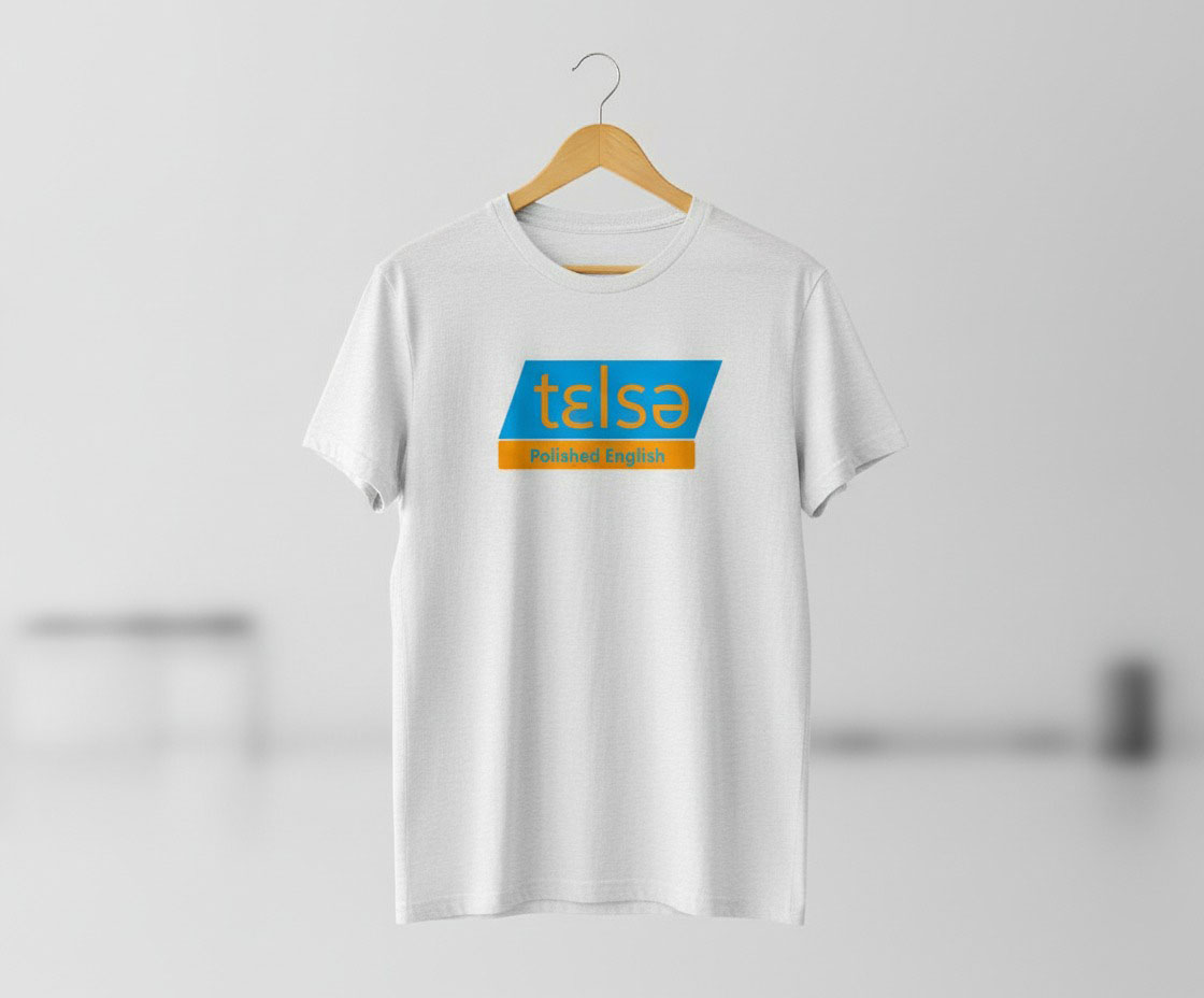
Logo Color Palette Typography Visual Assets Design for Print
Branding
2026

Telsa — Polished English

A brand identity for confident English pronunciation, built on clarity, trust, and modern linguistic science.

Telsa is an educational brand designed to help international English speakers pronounce English with the confidence and natural flow of native speakers. Built on tested and innovative linguistic methods, Telsa bridges the gap between academic phonetics and everyday spoken English—making pronunciation approachable, practical, and empowering. Aurorart was responsible for shaping a clear and memorable brand identity that reflects precision, warmth, and progress. The result is a visual system that feels professional yet inviting, academic yet human.

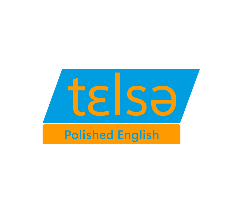
At the heart of Telsa’s brand is clarity—in speech, learning, and visual communication. The identity is designed to feel reassuring to learners while communicating credibility and expertise. The brand avoids rigid academic aesthetics in favor of a modern, friendly tone that encourages progress and curiosity.

Telsa’s color palette is built around two core tones: Sky Blue — symbolizing clarity, openness, and calm learning environments Bright Amber Orange — representing energy, confidence, and the moment of understanding when language “clicks” Together, they create a balanced contrast between trust and motivation—ideal for an educational brand that aims to inspire consistent practice.

Key Features

  • Scalable Identity
  • Color Psychology
  • Brand Applications
  • Mock-ups
  • Human-Centered
  • Design System